Insights Dashboard
- Company Tribe Dynamics
- Project Insights Dashboard
- Date January-May 2018
- Product Team Becca Yukelson & Krisna Sorathia
- Research & Publications Team Christina Vasiliou, Alex Rawitz & Merissa Ren
- Engineering Team Nicole Kowtko, Henry Chen & Christian Drappi
At Tribe Dynamics, I designed the first version of our Customer Insights Dashboard. After months of research, our team wanted to create a tool that helped our clients unpack the data they were seeing in a visual & interactive way. The below charts are geared to Corporate CMI teams (Consumer & Market Insights) as a way to gather interesting analytics on their brand’s influencer marketing initiatives.
I was involved in the end to end creation of this product, from research, wireframing, visual design & development handoff.
The problem
Tribe Dynamics’s proprietary metric EMV (Earned Media Value) assigns a value to content created by third-party members about a brand. This metric helps brands understand their ROI on their influencer marketing efforts.
When Tribe Dynamics first launced the competitive dashboard, our clients complained that EMV felt like a black box. They wanted to better understand the makeup of their brand’s influencer community and not just see a large number which was difficult to unpack.
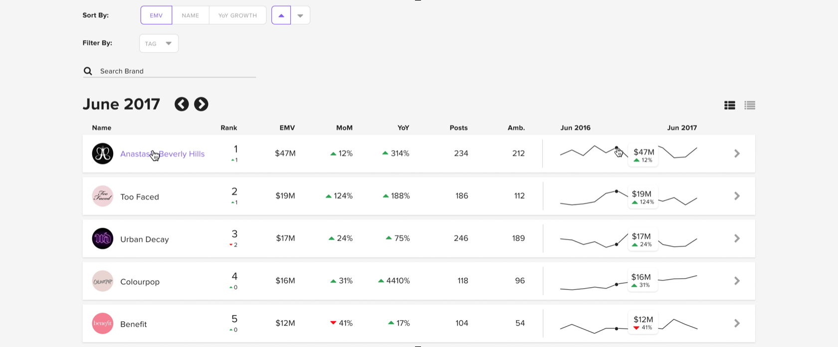
The original design of the competitve dashboard was simply tool for brands to compare their own brand against competitors by EMV.
The workshop
Our two-person product team partnered with members of Tribe’s research and publications team to better understand how they unpack EMV in their client reports. We learned that the written reports deliver value to clients in the following ways:
How EMV chages over time
How the size of the ambassador communities change over time
How the ambassador communities break down by follower tier
The QoQ Loyalty of ambassadors who are talking about brands
We quickly realized this was not only a way to deliver this data more timely to our clients through the software, but also the design of the Insights Dashboard would empower more efficient internal research for our publications team.
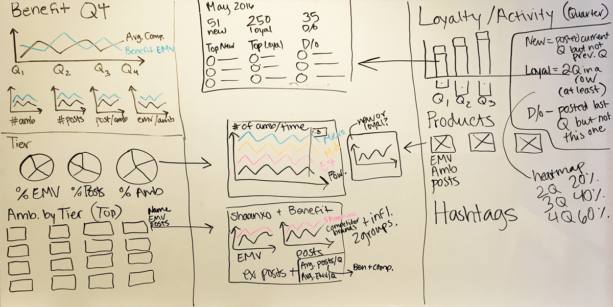
A whiteboard illustration from our "Insights Workshop". This is where we came up with initial ideas for how to visualize the vast amount of data we wanted to unpack for our clients.
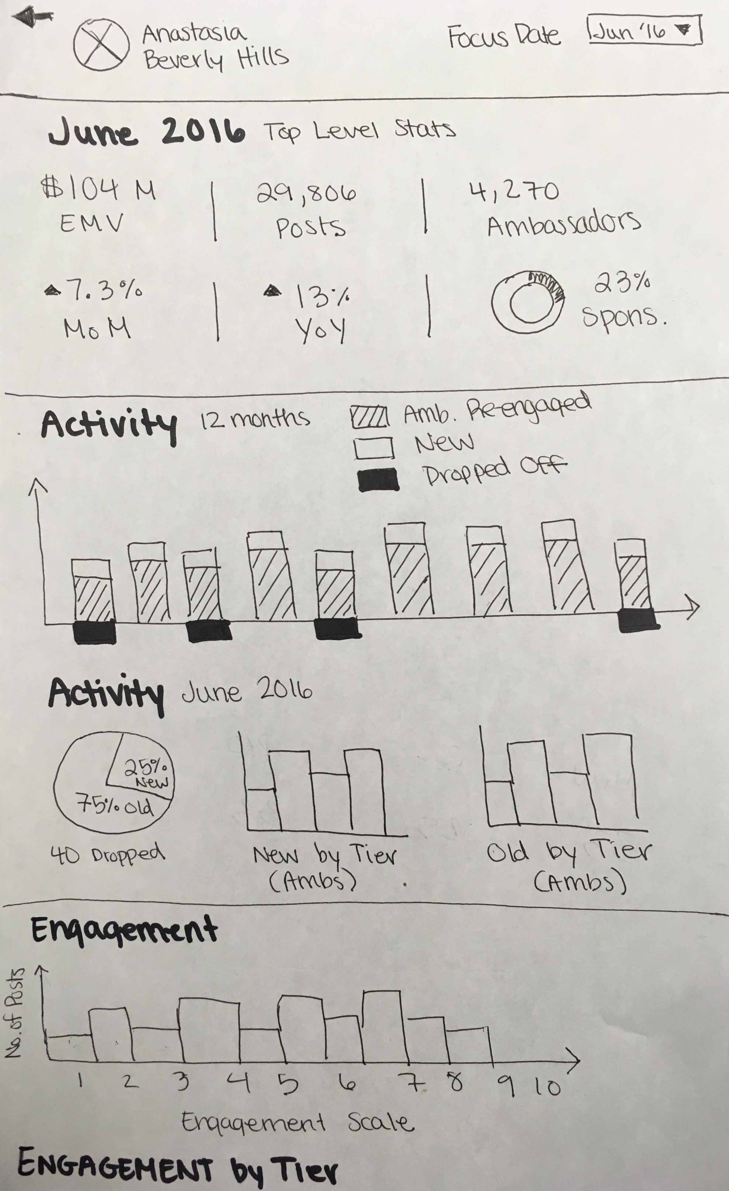
A more refined paper wireframe after the workshop.
The design
After the several rounds of wireframes, I began to design the high-fidelity mockups in Figma. We held two rounds of design reviews which included key stakeholders from our Customer Success, Publications and Engineering teams. We finally landed on the below visualizations.
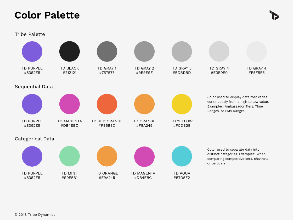
Our team had decided to transition over to Material Styling for the sake of easier development. All of the Material components were easily built using Vue.js and the Vuetify Component Library. Although the look and feel of the framework was very straight forward, the charts and graphs did require custom design.
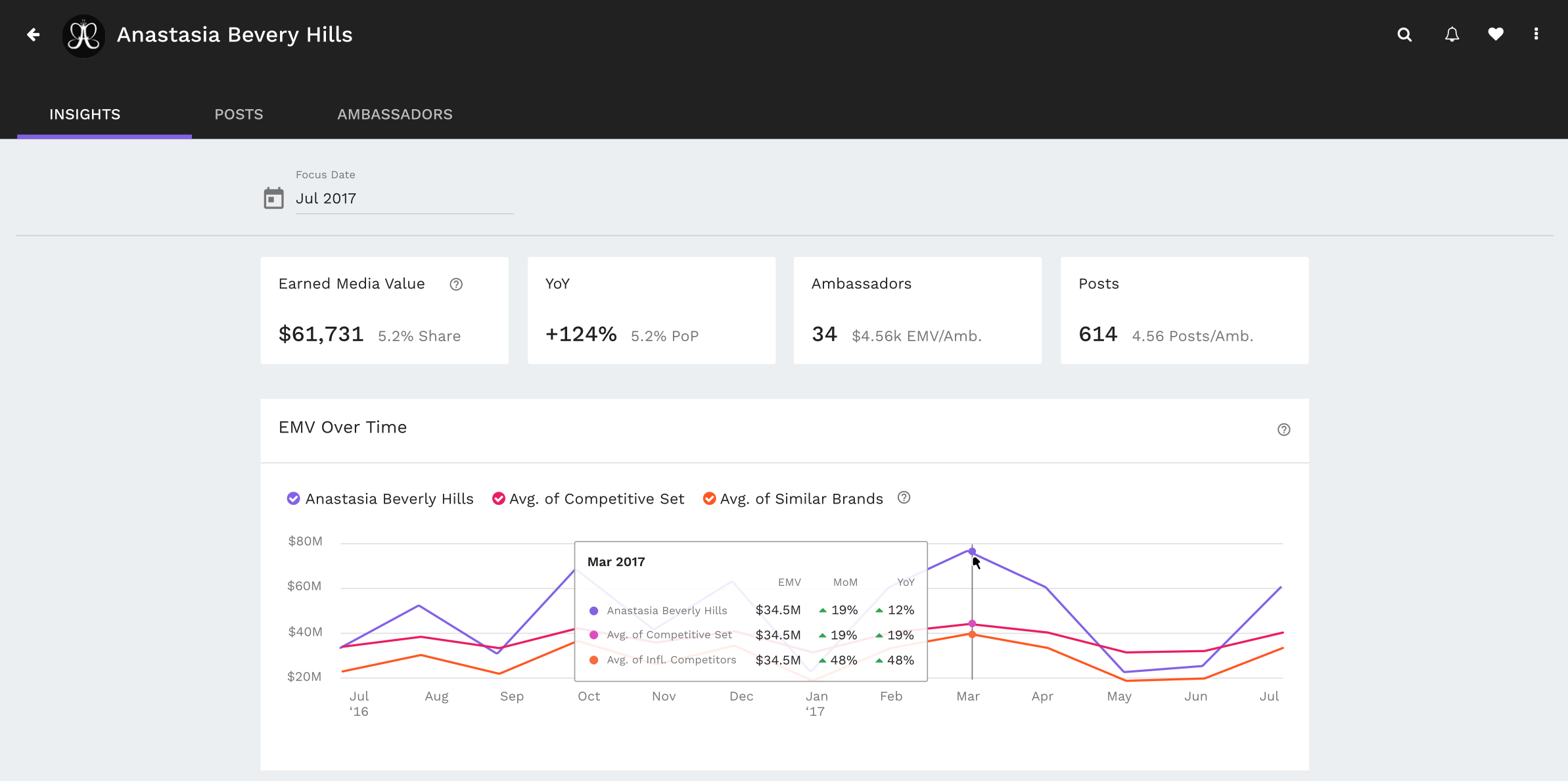
With the new design, users can click into a brand page from the Competitive Dashboard to receive higher-level insights. When clicking on the brand Anastasia Beverly Hills, the user first will see top level metrics and a timeline of the brand's Earned Media Value (EMV).
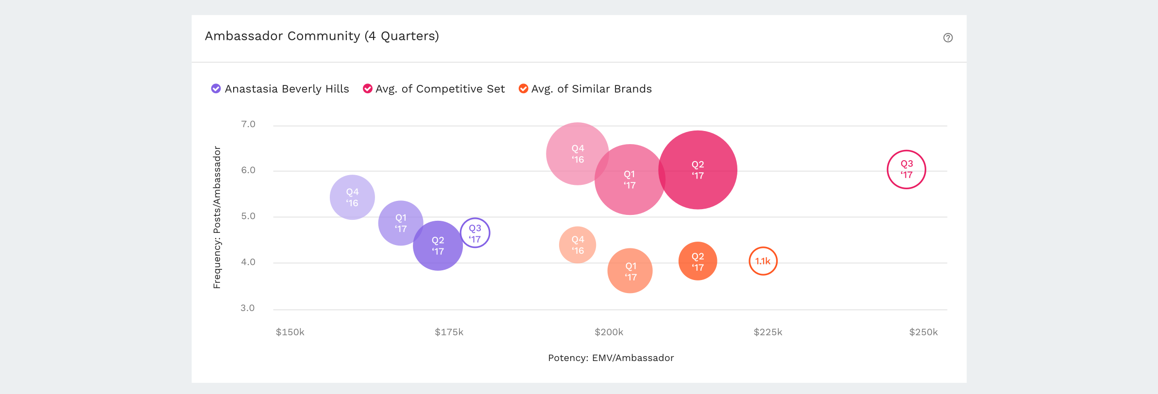
Ambassador Community Graph: The circle size represents the number of ambassadors who mentioned Anastasia on social media in a given quarter.
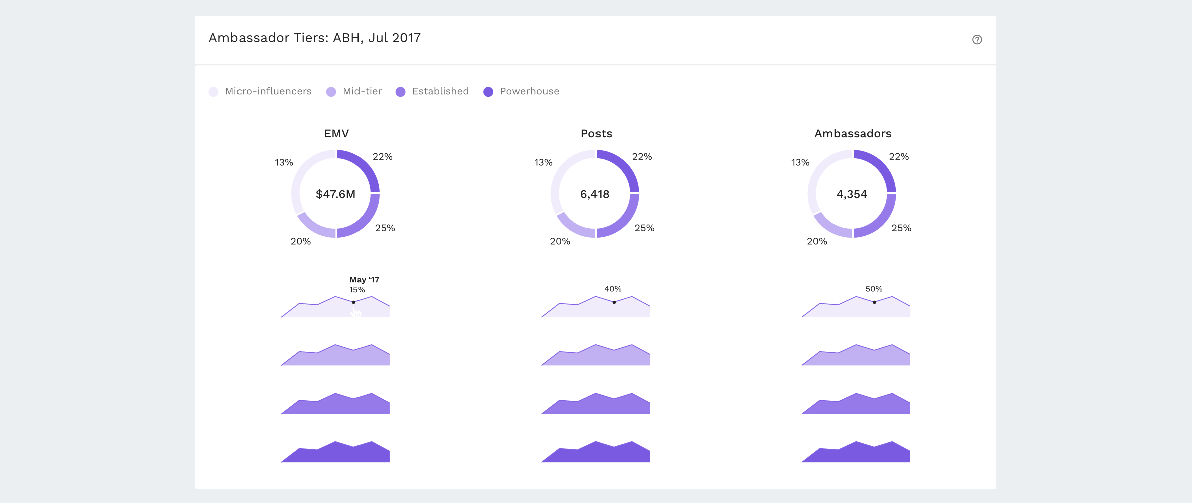
Influencer Tier Breakdown: The breakout of the brand's influencer community by audience size.

Ambassador Loyalty Graph: How many ambassadors spoke about the brand consistently and how many dropped off?

Qualitative Insights: Data visualizations only take the user so far, the Insights Dashboard also housed qualitative analysis on the brand's earned media performance.
Development & Wrap up
Our engineering team encountered a lot of hurdles piping in this new sort of data into the dashboard. The initial release of the Insights dashboard only included a few of the above components. Although it was not a complete set of visualizations, we received extremely positive feedback from our clients regarding the new look and feel.

